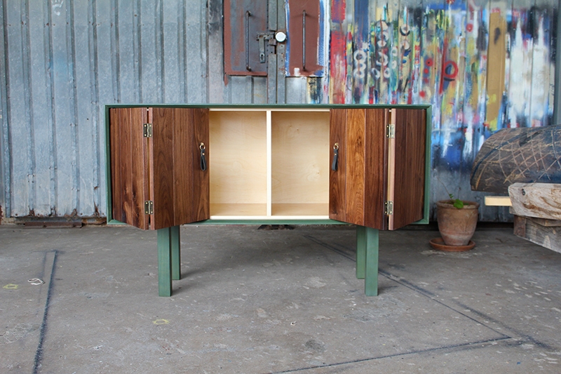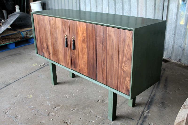
This credenza came about from one of my past clients wanting a cabinet for storing and serving snacks when he has clients over. He wanted something simple that works with the rest of the furniture and decor in the room, but a design that can stand by itself also.
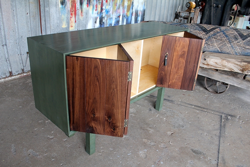
I wanted to focus on how the cabinet is used and engaged- first and foremost. I love an element of suprise when you open a door or drawer so I wanted a dark exterior and a light interior. The lightness also helps to show the contents of the cabinet in a better light. I started thinking about how the light interior is revealed to the user and wanted something theatrical. We went for a bi-fold door that reveals the contents a little at a time- like the curtains before a play is about to start. Each board of the walnut has a bevel on the edge so it creates a texture in regular intervals and makes the door read like many different boards rather than just two doors.
Most of the furniture in that room is walnut, so we chose solid walnut for the doors, but we didn’t want the walnut element to be too over powering so we decided on a painted exterior. We went for a forest green milk paint. we chose milk paint because it’s durable and wont chip off, but mostly because I’m interested in the idea of imperfections. It’s nearly impossible to get a perfectly consistent and flat paint job with milk paint as you get with spray paint or with using regular paint. But unlike regular paint where inconsistency is distracting, the slight difference in tones that milk paint brings enhances it and gives the piece a handcrafted element.
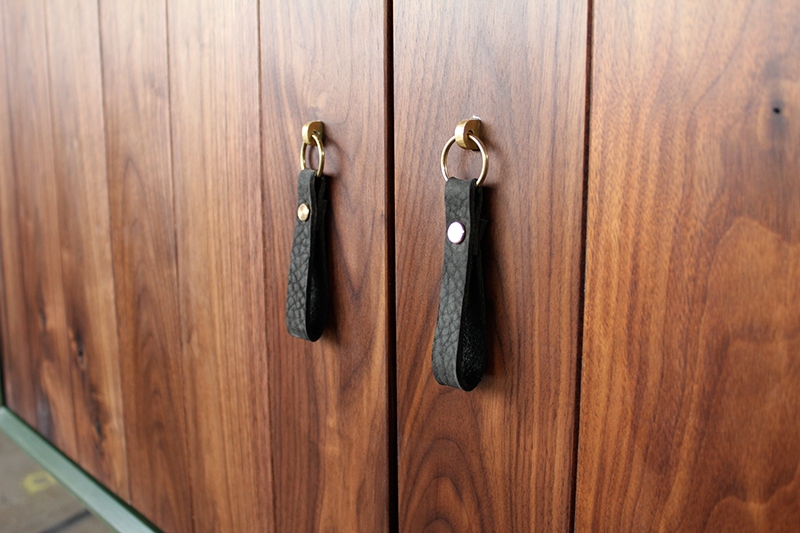
For the handles, I used a leather key chain made by an artist in London using nubuck leather and attached it to a brass tab that I custom made. The result is a soft tactile handle that is free moving so you can control the direction of the pull.


