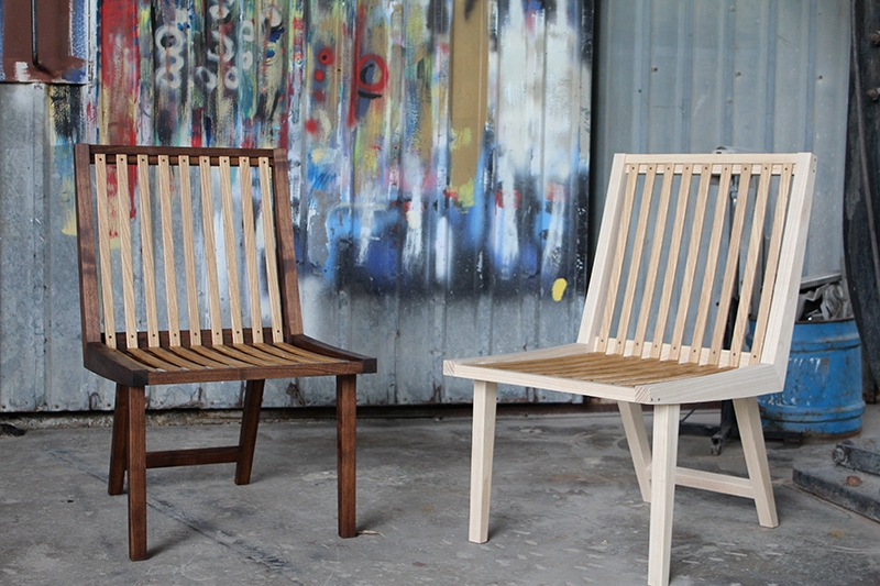
I’ve always wanted to design and make my own chairs, but have never had the opportunity to do so, so I used the East Austin Studio Tour as a reason to design and make my first chair. Chairs are furniture that is the demands the most from craftsmen. First, it has to be strong enough to withstand all the weight and wracking force of the sitter. Then, it has to comfortable enough for the sitter to sit in for a long time. Then, it has to serve the function of that specific chair. A dining chair should be light and upright so it’s easy to move around and eat from. A lounge chair should be a little lower with more angle so it invites relaxation, but it shouldn’t be hard to get out of. And then finally, it has to look great. Not just from the front and sides, but from all angles.
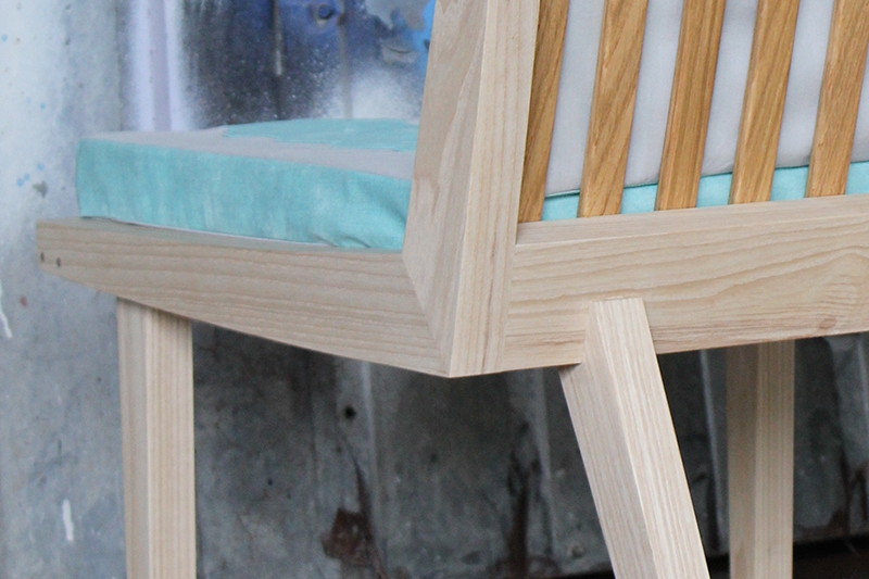
For this chair, I went for unorthodox or different joinery methods so I can experiment and play around. Why make anything speculatively if you don’t push the limits, right? My design focus was for the seat and back to be one unit, and that these curved boomerang shapes will be the focus of the form. I brought the front legs from the sides and attaches to the side with an angled half lap joint with pegs to make it extra sturdy. I also brought the back legs in from the side and created the joinery so that the back legs are visually and physically holding the seat up. The angle of the legs makes the chair joint harder to break but it also keeps the sitter from being able to tilt the whole chair back on just the back legs. The back legs are mortise and tenoned in to the seat with dowels for extra grabbing power.
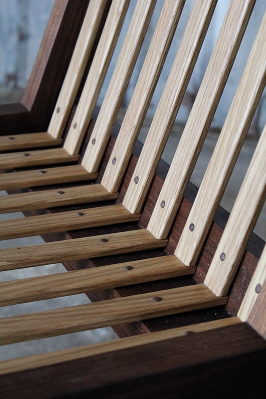
For the seat and back rest supports, I decided to laminate oak into curved slats that mimic the chair sides. The lamination makes it so I can get away with thinner material and makes the chair look nice with or without the upholstery. But just in case one of them does fail, I installed the slats using a dowel that has been hammered to create a mushroom like metal rivets. The wood rivets makes for a nice visual as well as tactile experience. I think the slats also make the piece look Nakashima-esque, but I may just be flattering myself.
You can’t have a lounge chair without cushions, so I commissioned my quilting and sewing friend Shannon Harris, to design and create the cushions to that would go well with the chairs. She came up with a simple and modern upholstery design using hexagons that compliments the lounge chairs well. I think the unique design fits in with the unique design of the chair perfectly. There is also a feeling of masculine and feminine to the chairs and upholstery by the wood and colors chosen. Also, for the show I asked Shannon to design a quilt that we could drape over the back of the chairs to create another layer. I also think it brings a feeling of warmth and that the furniture is ‘lived in’. The quilt is beautiful! the hexagon pattern flows from one corner to the other with changing tones. It speaks to the modern aesthetic while bringing warmth- which a lot of modern designs are lacking in.


